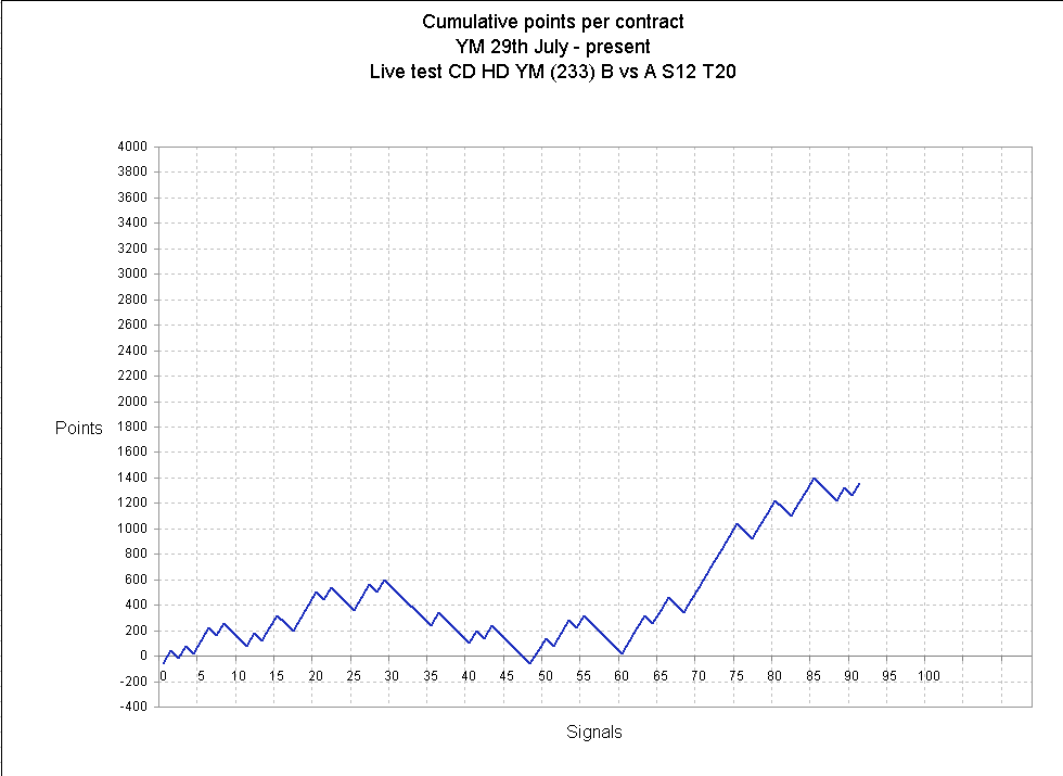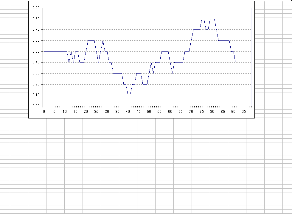

The chart below is a 10 period moving average of the run of trades, so it's really a moving average showing how the strategy fluctuates between winning and losing phases.
On the lower chart you can see that by trade 40 the vertical scale reaches 0.1, this reflects that of the 11 trades prior to that point, 10 were losers. Similarly by trade 80 the vertical scale is 0.8, reflecting that of the 10 trades prior to that point, 8 were winners, 2 were losers. It's an interesting way to look at the strategy.
I suppose it could be used as some sort of filter but I think if you start trading the equity curve it would destroy or interfere with the efficiency of the system in a negative way. It just adds another layer where potential error can occur.
I've often thought the that perfect strategy would be one where the performance moves like a sine wave; and of course a sine wave is easily traded.
I'm running this for another month so I am looking for a continuation of the positive upward trend.
No comments:
Post a Comment