1st October 2010 to 14th February 2012
"
PositiveDeviant, on 11 Apr 2011 - 8:10 PM, said:
Some more analysis I did to try and give me a backdrop to the market in general.
Charts are all in log scale on a 1 year time-frame.
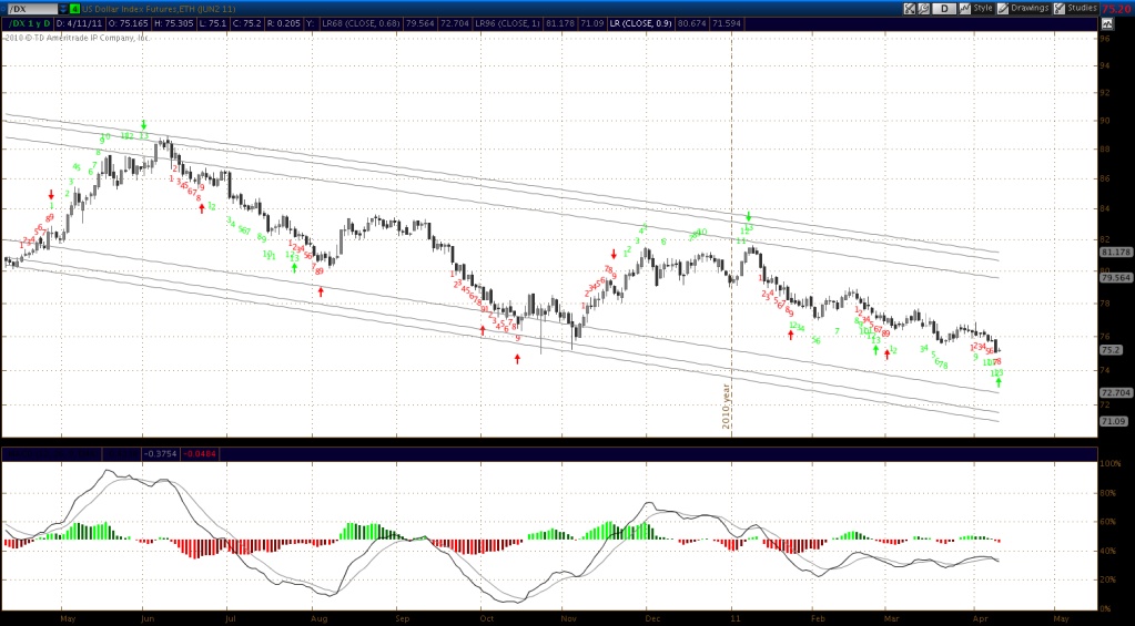
Dollar Index
The US dollar index is in a clear downtrend however a Tom DeMark sequential countdown buy signal (green up arrow at current price) has been generated today. A PDF explaining Tom DeMark indicators can be found here. I have found these to be useful in the past but the joke is it picks 10 out of every 7 market tops (or bottoms).
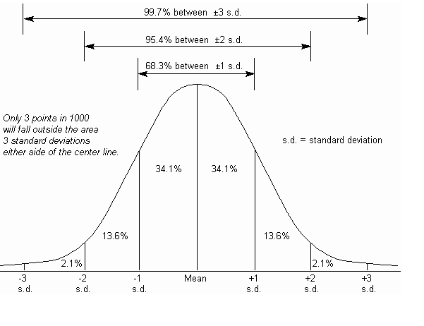
The channel lines are Linear Regression channel trendlines. These section off price action to show extremes in price action. When the price is at the far upper or lower line it can be said to be 3 standard deviations from the mean price covering the last year. What I've also set it to show is the 95% line, 2 standard deviations from the mean price. So if price is at the upper or lower 95% line you can say it's at a price extreme that has only been seen 5% of the time during the past year, two standard deviations from the mean price.
I also show the 68% lines, that's those lines closest to the middle of the channel. The reason for this is because I want to section of the trend channel in the same way as a bell curve distribution, so that I can easily see areas where the price is 1, 2 or 3 standard deviations from the mean price.
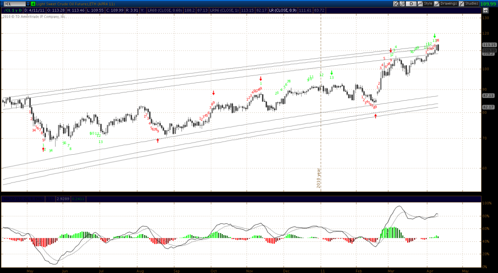
Crude oil futures
In the Crude futures chart we can see a Tom Demark countdown sell signal was generated on April 7th, since then the price touched the 3rd standard deviation line, and today has moved inside the 2nd standard deviation line. Standard deviation is based on mean price and is therefore a moving target but it's interesting to note.
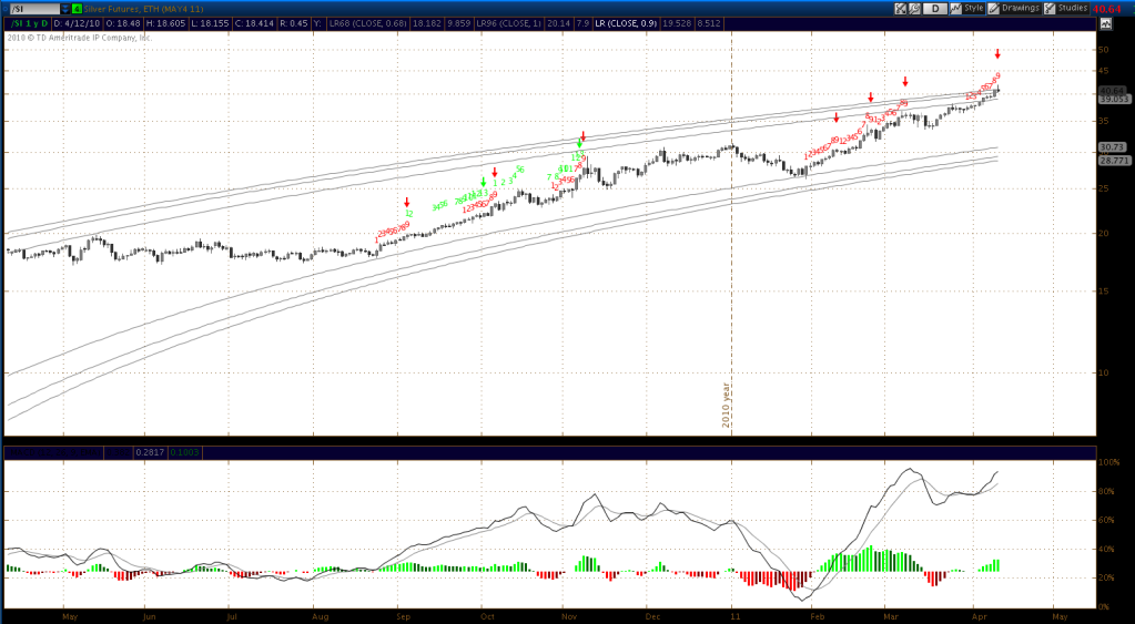
Silver futures
This chart shows a Tom Demark sell setup signal (red arrow on current price), not as strong a sell signal as the countdown sell signal but a signal nonetheless. Price is at the 3rd standard deviation line but again it is a moving target.
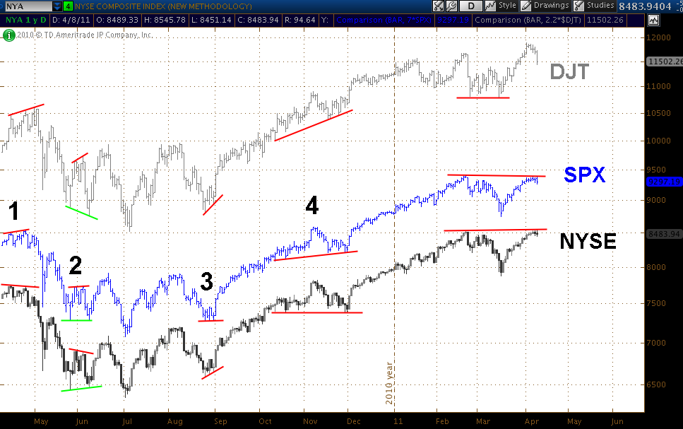
I also looked at divergences comparing the NYSE composite to the Dow Jones Transports and SPX;
At 1, during April last year, the NYSE composite made a lower high whilst the other two made higher highs, prior to the market drop.
At 2, at the end of May into June, the NYSE again made a lower high contrary to the other two and prior to a brief drop. It also made a higher low early in June, contrary to the other two, prior to a rally.
At 3, again higher highs were made as the SPX traded sideways and the DJT made higher highs.
At 4, resistance was seen, whilst the other two made higher highs. More recently on March 18th the DJT found resistance level whilst SPX bottomed.
The DJT then broke out but the other two appear to have found recent resistance and did not follow through.
So in summary all of the above suggests to me that we may be at a market top right now.
PositiveDeviant, on 29 May 2011 - 10:08 PM, said:
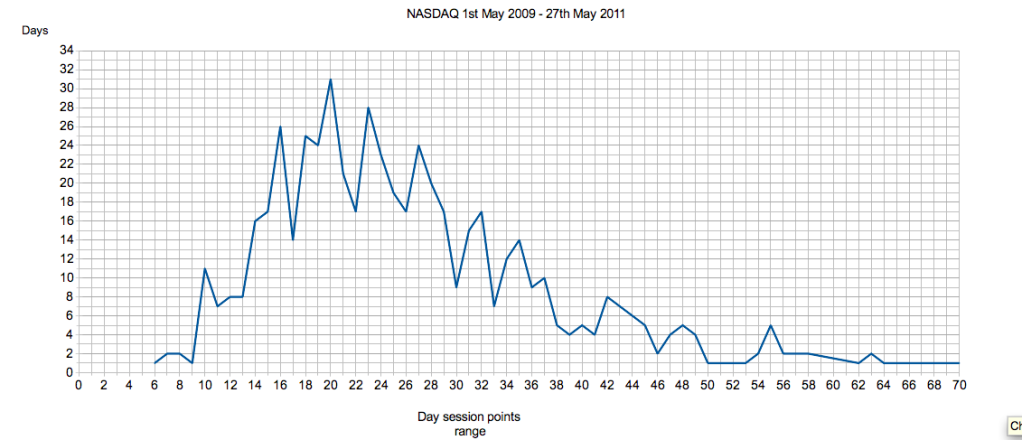
I've been looking at some day session data on the NASDAQ 100 in order to gauge the frequency and range of points moves.
Using data from 1st May 2009 to 27th May 2011 I looked at daily points ranges (for the day session), and the frequency of different ranges during this time period, and charted them.
This shows that there are very few days where the range is 10 points or less, and that there are very few high range days, which is what you would expect to see.
The most common points range is 20 points. 20 point range days occurred on 31 separate trading days for the time period charted.
It's appears from the chart that the bulk of points ranges for the day session appear to be between 14 and 29 points.
Looking at it from the perspective of a bell curve, the most common points ranges are between 12 and 31, these occur 68% of the time. That is one standard deviation using the data shown. Day sessions with ranges above or below that are therefore less common, found only 32% of the time.
Of course there are many variables here such as the selection of data used. I used from 1st May 2009 to remove the volatility from the tail end of the crash, that bottomed in March 2009 (the volatility would skew the data). Periods like that are exceptional. Another factor is that clearly as markets rise in value their day session range would tend to extend also, and as some of the dataset was from when the NASDAQ 100 was several hundred point lower, this is likely to have skewed the end result to a degree. This is likely to mean that the 0 to 1 standard deviation range of 12 to 31 may actually be around 14 - 33, based on the present valuation.
Volatility is also something that needs to be examined, and the impact that has on day session ranges. That is something else that can be looked at, at some point.
For the trades I take I also keep stats afterwards of what could have been achieved over the whole move without using a trailing stop, to see the maximum points available from each trade. This is so that over time I can gauge what a reasonable expectation of points might be, for the trades that do particularly well. Looking at the data from the trades I initiated, there were only 4 trades with a possible yield of over 30 points (and that's nearly 100 trades). So that's certainly in line with what I've shown here.
There is an argument to be made for a different approach to stop-loss management here, and that is, if a trades get above a certain number of points, eg towards the 31 figure, the stop should be moved closer to the price, since at that time the case for a larger move is diminished. I may also look at a more dynamic approach such as reducing my trailing stop as a trade gets over 20 points, and gradually reducing it further as it gains more, to keep the trade in line with the bell curve distribution of day session points ranges.
This is with a nod to Niederhoffer - Quantify Quantify Quanfity
PositiveDeviant, on 12 Jun 2011 - 9:22 PM, said:
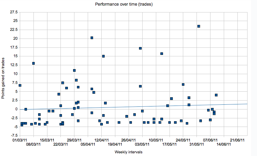
I also looked at points gained on trades over time;
The trend is up. This is good and means my performance trading the system is improving. There are proportionally more trades during March, as I took March off work to trade full time.
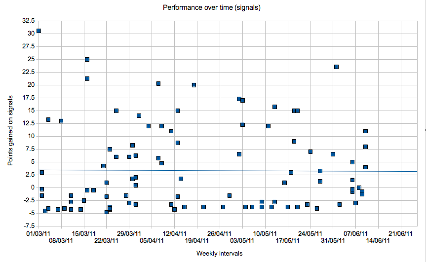
I also had a look at the performance of the system as a whole, that is all of the signals generated up until now;
The trend is flat, this is also good, confirming that so far, the system is consistent.
PositiveDeviant, on 18 Jun 2011 - 11:46 AM, said:
~Some quotes;
"With self-discipline anything is possible"
-TR
"Energy and persistence conquer all things."
-Benjamin Franklin
"You can have anything you want - if you want it badly enough. You can be anything you want to be, do anything you set out to accomplish if you hold to that desire with singleness of purpose."
-Abraham Lincoln
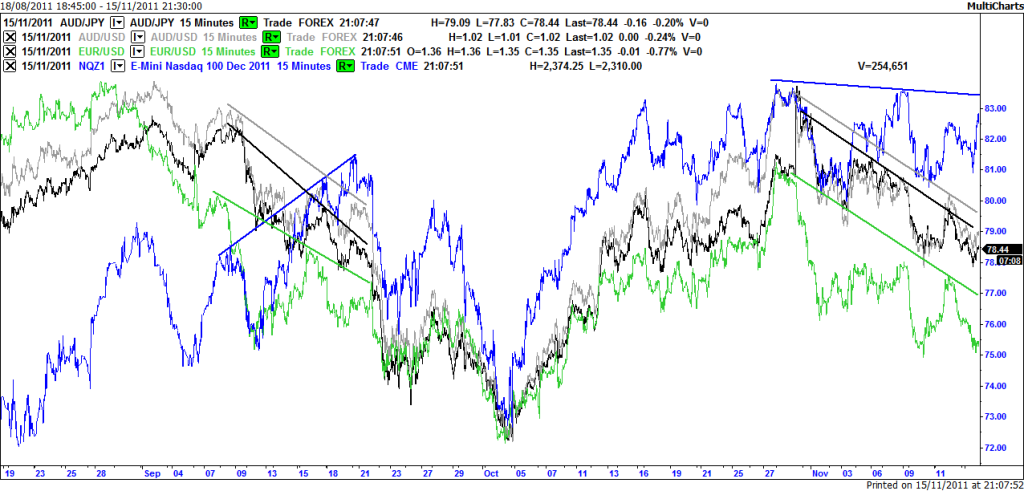
PositiveDeviant, on 16 Nov 2011 - 04:58 AM, said:
Currency divergence with E-Mini NASDAQ, EUR/USD, AUD/USD and AUD/JPY (19th Aug to 15th November);
This shows clear divergence between the NASDAQ and key currencies between 7th and 21st September, NASDAQ trending up whilst currencies are trending down, this tends to lead into corrections in the NASDAQ. More recently the Euro is diverging away from the pack.
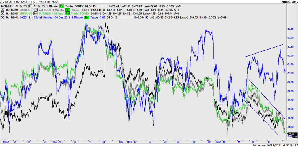
Currency divergence with E-Mini NASDAQ, EUR/USD, AUD/USD and AUD/JPY (21st Oct to 16th November);
Looking more closely, recently there is clear divergence of the type that leads into a correction, similar in nature to the first chart between 15th and 21st of September, but not as pronounced. I understand EUR/USD is now at a 5 week low.
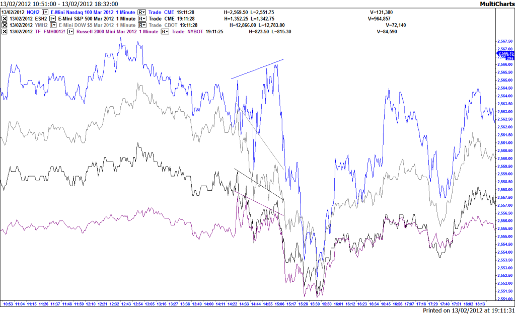
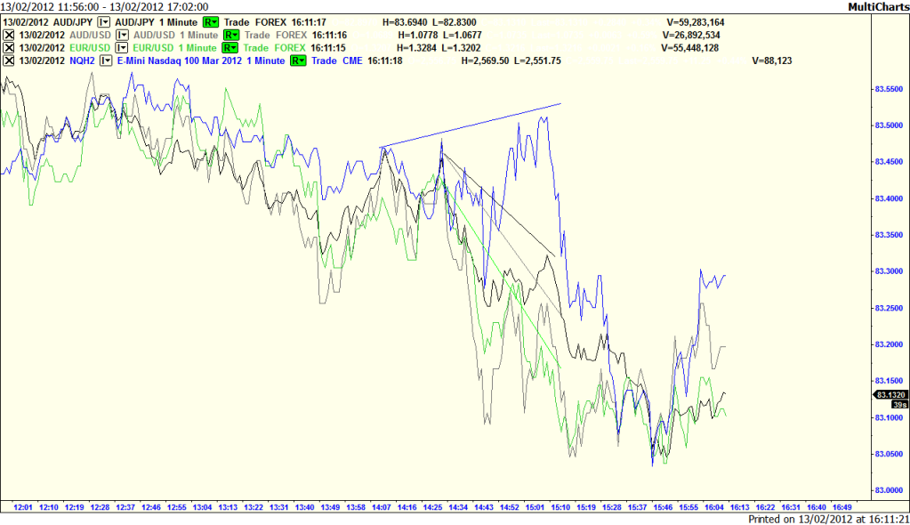
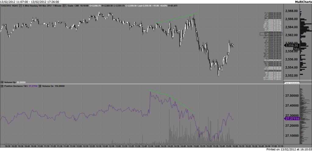
PositiveDeviant, on 13 Feb 2012 - 11:23 PM, said:
Further divergence set up;
No comments:
Post a Comment